Steampunk Wacom, Part 1 (The Stylus)
A lap desk is a throwback to a Victorian era travel necessity for any well connected globe trotter that needs to keep up with correspondence. Perhaps a lap desk could be considered the laptop of the 1800’s. It certainly makes sense based on name and function. The surface layout of a Wacom tablet (especially an Intuos 2) is remarkably similar to the divide between the richly veneered wood and felt on the business surface of a lap desk. There are also cool compartments that come along with a lap desk design that can serve as storage space for a stylus and those tiny tips that I keep losing. Although in disrepair, I didn’t want to cannibalize the lap desk for parts since it was nearly intact and a little on the small side. Instead I began a slow and methodical process of selectively collecting objects and materials I could use and re-manufacture into like components, all from recycled parts of course!
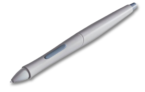
Original Intuos 2 Stylus
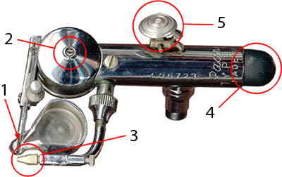
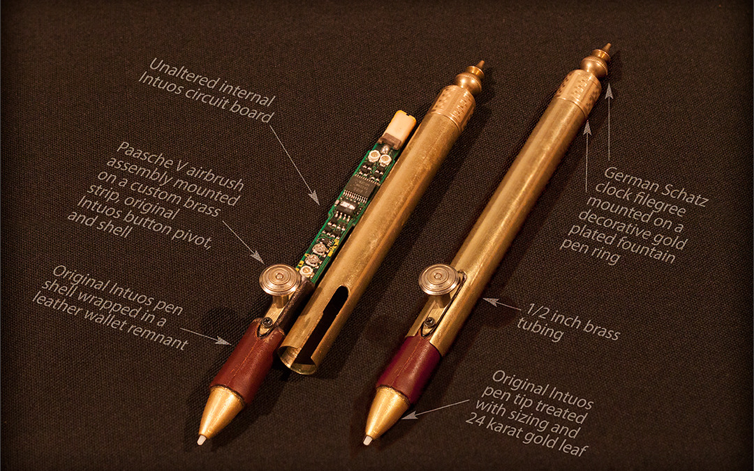
I worked first on the stylus (unmodified original shown on the left) knowing that this would be the most intricate work. Must-have materials in any good Steampunk creation are always brass, wood, and leather. This led me to work out a design for the stylus based off of airbrush, fountain pen, and clock parts which I had lying around. The stylus has three controls other than the tip. The rocking button in the middle of the stylus looks like a single slim button, but once one gets into the guts of the stylus it is clear that the button design triggers two independent toggles on the internal circuit board. The third control is the digital eraser on the back end of the stylus.
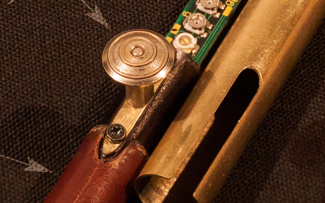
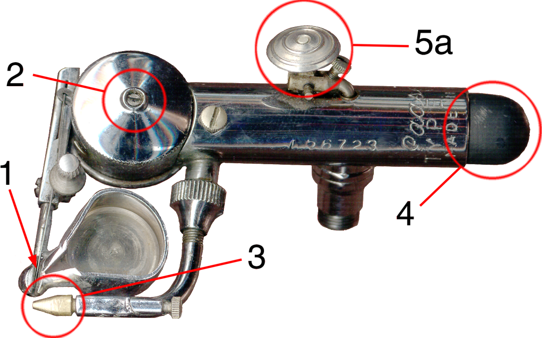
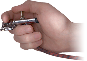
A rocking motion is an ideal movement for dual trigger mechanisms found on most airbrushes which is why I chose to modifiy the rocking button assembly by mounting a trigger from an old Passche airbrush on top of it. See my Custom AB post for comparison with the image above. This actually works better for me since the trigger puts my finger in a more relaxed position above the stylus, and I don’t have to move my finger to opposite ends of a button bar to toggle the two controls. Instead I just use the trigger’s rocking motion the same way I would control paint flow on an airbrush. Coincidentally I also happen to own an airbrush version of the Wacom stylus which is even more awkward to use than a traditional button stylus. I was always baffled by Wacom’s choice of a hybrid mouse wheel over a traditional airbrush trigger on that device. Wacom built pressure sensitivity into the stylus tip. Why not do the same for virtual paint flow on a trigger?
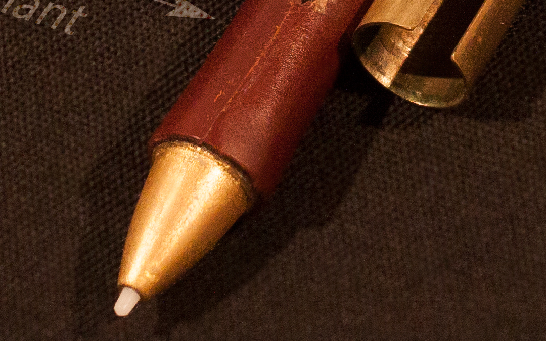
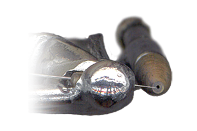
I chose 1/2 inch brass tubing for the stylus body and discovered early on that any type of metal at the front of the stylus interferes with the signal reception at the tip. I changed my design as a result of this, and decided to modify and cover the existing stylus body with non metallic materials. In this case, I used a strip of leather from an old wallet interior applied with a strong cyanoacrylate adhesive, and behind that, permanent black ink from an overhead projection marker to mask the original color of the light gray body. I was able to get away with a gilding process at the tip using 24 carat gold leaf probably because its such a thin metal. The important thing is that it works! The assembly required precise cutting of the stylus body, leather, and brass tubing, plus the manufacture of a small brass strip to cover the rocking button.
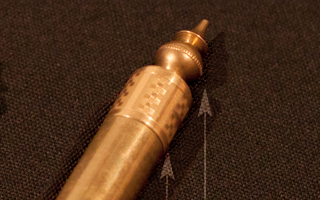
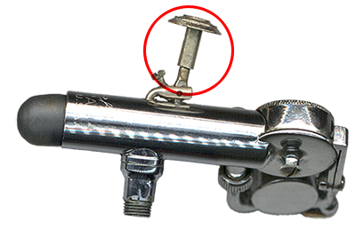
At the opposite end of the stylus I sacrificed the eraser functionality for a bit of decorative metallic flair. I never got used to flipping my stylus around like a pencil when I could instantly toggle the eraser by moving the function to the back toggle on the trigger. The finial at the end of the stylus is a decorative gold plated band from an old 1930’s fountain pen and a finial from a Schatz German table clock. Those parts were merged together with a few threaded brass parts I had laying around (not sure where they came from) and some foil tape typically used for masking photo slides. The foil tape was used to help non-threaded parts like the pen ring fit snugly over the other brass parts. This one detail makes the design LOOK Victorian.
Stay tuned for Part 2 of this post, where I will discuss the process I went through in finding and assembling recycled parts for the tablet’s body.