Step-by-Step Media Guide Cover Design

Step-By-Step Stage 1: The color comp
This color mock-up lays out the placement and style of major elements for the cover design. The art director’s notes are laid out in the margins as suggestions to follow. As the design progresses you will see adjustments made to some of the typographical elements at the bottom and top right of the design as well as some background elements. The decision to focus on a customized type font for the word “Cardinal” carried off a movie poster look and feel in a cleaner fashion for a magazine sized media guide layout. The other team names were added into the poster version of the illustration.
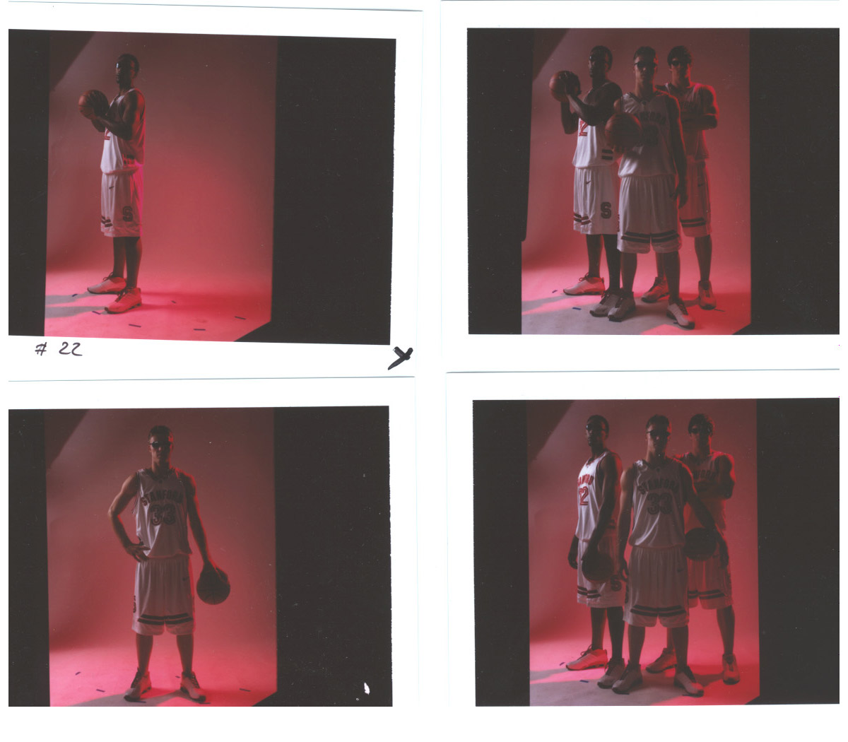
Step-By-Step Stage 2: Digital test shots
Some examples from several low resolution test shots are shown here. Ball position, stance, ambient lighting, cast shadow, facial highlights, and backdrop got adjusted at this stage to produce the best possible results in preparation for a final high resolution photo shoot.
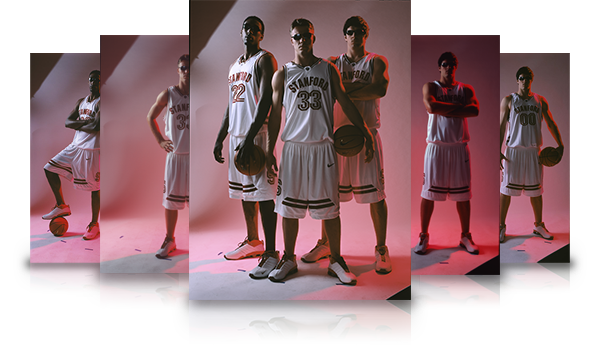
Step-By-Step Stage 3: Final photo set
The final photo set incorporated the best qualities of all criteria mentioned above. Each photo had its background removed with a third-party filtering tool which greatly sped up the time and accuracy of sampling out the background from each of the photos.
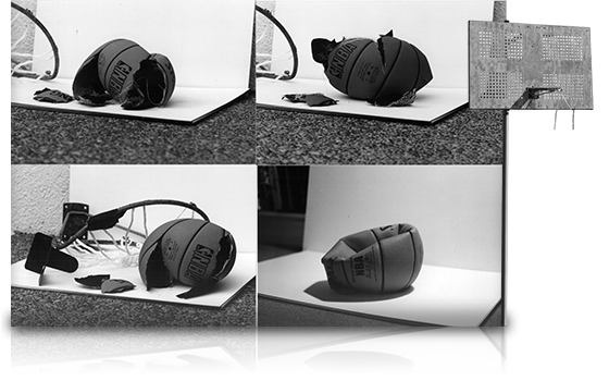
Step-By-Step Stage 4: Additional photo elements
Smaller photo elements provided background objects for better depth in the composition. Exploded basketballs, pulled from a previous “Towers of Power” project, also done for Stanford, and a rusted backboard gave better depth for the cascading elements added later in the design.

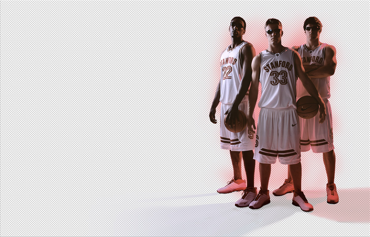
Step-By-Step Stage 5: Players positioned in the foreground
This group of layers built up several hue and saturation, levels, color balance, and shadow layers linked to alpha channels. All the layers except the original player masks remain invisible in this slide to show contrast with the next slide which reveals the difference these adjustments have when turned on against a white background.
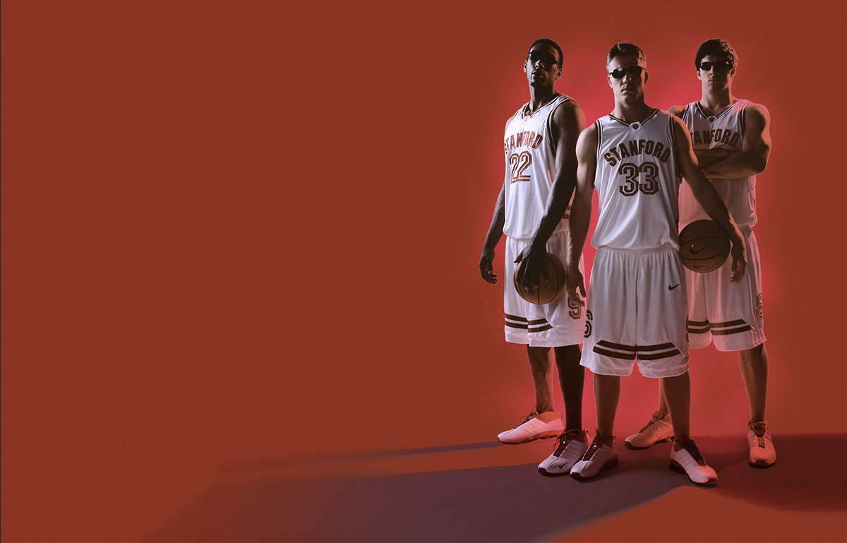
Step-By-Step Stage 6: Shadow and glow
All color, level, saturation, and glow layers are on in this slide. The next slide will show how they interact differently against a cardinal red background.
Step-By-Step Stage 7: Background & cast shadows
The cardinal red background, glows, and cast shadow layers are now visible. The adjustment layers turned on in the previous slide interact with all layers placed beneath them. The next slide will show how glow and cast shadows interact naturally with sub-layered elements as more textural elements are layered into the design.
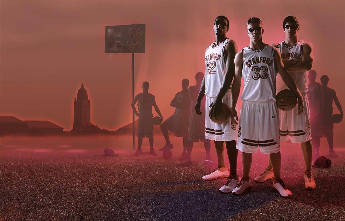
Step-By-Step Stage 8: Asphalt & shadow color
The asphalt texture and shadow color begin to build up solid foreground texture. The asphalt, rendered from a seamless texture, repeats once across the spine. The color layer in the cast shadow has been re-applied as a color overlay from the original photo to interact with the subtle colors in the asphalt, giving it a slightly purplish hue.


Step-By-Step Stage 9: Background elements
More background elements are applied to give further expanse to the depth of the composition. All of the background elements have a severe level adjustment that suggests they are partially obscured by a thick haze. Notice the mist-like texture building up at the ground level.
Step-By-Step Stage 10: Final background elements
Several layers have been applied in this slide affecting everything from the shadow in the foreground to the mist and glowing elements in the background. New building elements have also been added to the background. These were not in the original color comp because they were a client request midway through the design phase.
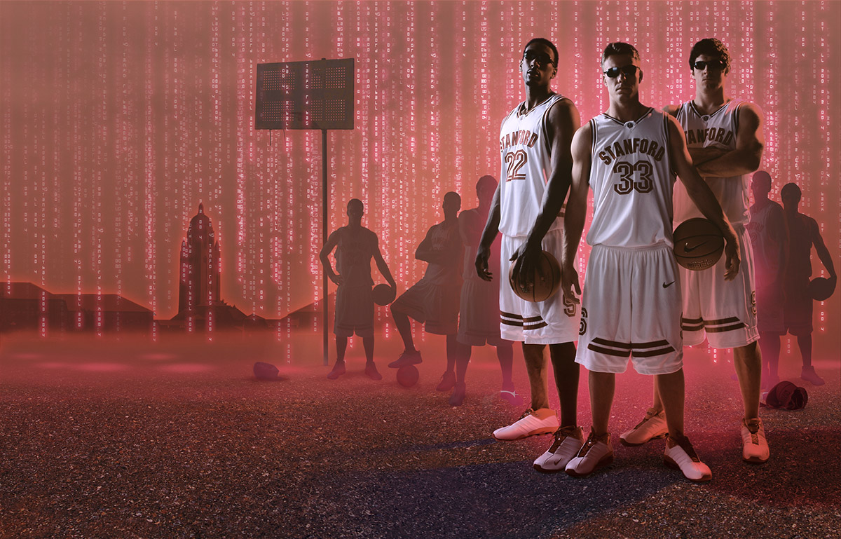
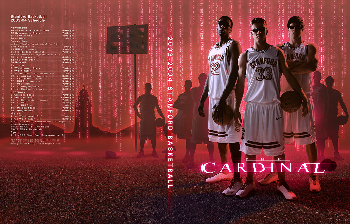
Step-By-Step Stage 11: The cascade
A familiar cascade of code rendered against the cardinal background adds a final touch of depth to the composition in this slide. The text is not code, but the school’s name and season details spelled out vertically and repeating hundreds of times across the background.
Step-By-Step Stage 12: Final copy
The last group of layers added, and the only group not flattened for delivery, was the copy. The “Matrix” font did not look good with the Cardinal title. Instead, this font was custom designed in Illustrator by converting a normal style font to outlines for the redesign of various type elements. This allowed for a font designed specifically for the word “Cardinal”.
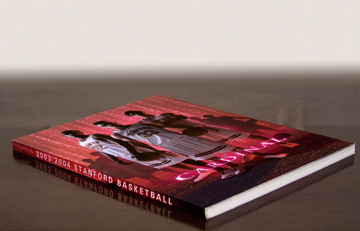
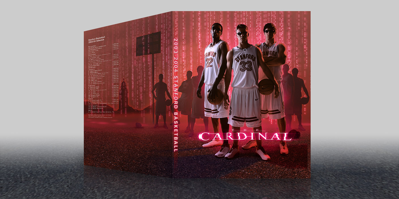
Step By Step Stage 13: Final printed guide
All layers and design elements come together to produce a visually grabbing cover designed to inspire potential college basketball recruits. The deliverable for this project included two high-resolution Photoshop files (one containing a separate copy layer for the printer to adjust) and an Illustrator file of the copy on the back cover for last-minute schedule changes, or for the option to produce a text knockout, if required.